Grey is built to support the way you manage money across borders. That’s why we’ve redesigned the homepage to make things easier to follow and quicker to act on.
The new design brings clearer balances, guided actions, and important updates right where you need them.
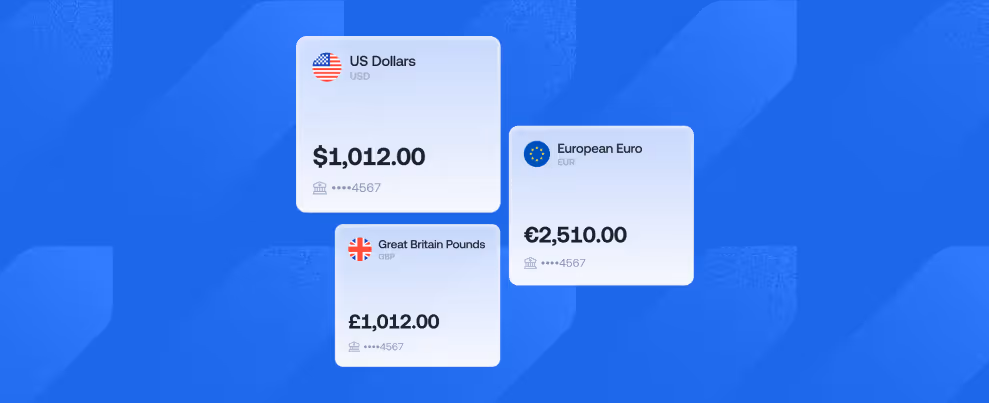
Instead of jumping between wallets, you now see your total funds across all wallets in one place, with a clear breakdown by fiat, stablecoins, and cards. No more switching screens to get the full picture.

Wallet cards now give you a quick visual view of your active balances across currencies and assets, making it easier to spot what’s available and where. Think of it as a snapshot of everything that’s currently in use, without digging through menus.
New onboarding banners include a simple to-do checklist that guides you through key steps like verifying your email, completing KYC, creating a card, or making your first transaction.
If you’re just getting started on Grey, the new homepage won’t leave you guessing.
If your KYC is rejected, a new “Tell me why” banner helps you understand the issue. Instead of hitting a wall or immediately contacting support, you’ll be able to understand what happened and what needs fixing.
With the new homepage experience, transactions now show a clear timeline and cycle, so you can see what stage your transfer is in and what’s happening behind the scenes. It gives you more control and helps Support resolve issues faster when needed.
The new homepage introduces in-app banners for alerts, errors, and status updates, so you don’t miss critical information about your account or transactions.
Clear messages, right when they matter, mean fewer surprises and faster resolutions.
The new Grey homepage is designed to make managing your money clearer, faster, and more intuitive.
Everything you need is right where you expect it. Update your Grey app and explore the new experience.


.svg)
Back to top